Published
•3 min read
Three content-blocking tactics to avoid careless scrolling

Around a month ago, I wrote about reducing mindless scrolling without external software. Two weeks ago I showed how to block the distracting content. Now let us discuss the options and flavours of content blocking.
I was experimenting with multiple scenarios of blocking, for example:
- block access to the website completely,
- give me X minutes per day to saturate with the content, then block,
- turn the phone to grayscale, so it looks less appealing instead of blocking.
“X minutes per day to saturate with content” tactic
“X minutes per day to saturate” was a smart move to give some restrictions initially.
The drawback was that when some article or comments thread was exciting and my time was up, I ended up curious… Curious about what happened at the end of the story and how the discussion ended, or just interested in the topic. So I kept looking for information about it on other websites.
This might work well for novices afraid of blocking the content entirely.
Turn the entire screen into grayscale
Some say that the web is addictive because it is so colourful and appealing. I tried to make it less “nice” by cutting out the colours.
Grayscaled app icons also don’t look so appealing. Way less temptation to press them.
If you’re addicted to rich visual content like YouTube, TikTok or Instagram. I encourage you to try grayscale. It works on the whole phone, even outside the browser – on installed apps.
To try it, there is an option in the developer’s options menu. The mechanism is described well here on WIRED.
I tried removing colours only for “restricted websites” as well as turning my whole smartphone into grayscale (menu in icons, messages etc.).
The effect wasn’t so significant for me. I’m mostly looking for content to read, so grayscale is not as much of an obstacle.
Redirect to a newsletter
This is my favourite option. If I try to enter some website by habit, my brain feels bored and craves entertainment. So I trick my brain.
Instead of just seeing “block page”, I see the latest newsletters in my inbox.
It is much better because I only subscribe to things that inspire me positively.
There is no space in my newsletter inbox for world news, endless memes or low-quality content. So I feed my brain with something worthy.
Newsletters are usually longer pieces of text. Thanks to that, I have to focus longer than a few seconds on a single thing. So, it also fights “context switching” and calms me down.
To redirect you can use LeechBlock – a tool described in the “ how to block distracting content “ issue.
My current approach
It looks like blocking completely, plus a small buffer for links from friends, works best. Then I seek “entertainment” in newsletters.
However, I leave this buffer only on a desktop machine because it is less risky for me to stay on the website longer than needed.
Stay in the Flow – Explore More Stories

Follow this checklist to reduce doomscrolling and reclaim your time with effective digital detox strategies.

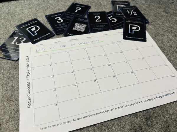
Boost productivity by focusing on one key task per day. Try the free Focus Calendar tool to plan your tasks and track progress. Simple, effective, printable.

This step-by-step tutorial guides you in creating your own cards, perfect for card-based project, like designing a board game or using Agile Poker Cards PDF.

